
Enterprise UX Design
Creating a unified agency presence.

Project Brief
As part of a dedicated User Experience (UX) team, I worked as the Lead UX Architect to reimagine an enterprise scale website for USAID. The project was challenging, because the original USAID had grown organically to include a mix of interface designs, nomenclature, server architectures, navigation, and structure. Over the course of six months, the team and I created a redesigned site structure and interface language that unified the USAID web presence. The project involved primary research, audience needs definition, structural planning, wireframe designs, usability testing, and content mapping.
Understanding the Requirements
Before work could begin on redeveloping this enterprise-level website, it was crucial to understand how the existing website was organized and what content existed there. I developed a content map of the existing website that documented over 1,500 pages and seven levels of navigation. Using stakeholder feedback to contextualize executive intent and business priorities, my team and I conducted a heuristic audit of selected website pages to provide expert guidance and prioritize usability concerns.


Establishing a Baseline—Website Audit
Once the pages were inventoried, I developed an evaluation survey that recorded answers on a Likert. Using a weighted scoring system, I normalized these data to quantify the heuristic audit of the site.
Understanding the Audience—Focus Groups and Card Sorting Activities

I led a primary research study to explore website preferences of priority audience segments. Amongst these was a category described as “super users” who relied on the website for funding and grant information. Using Focus Groups and Card Sorting activities (open and closed), I developed insights into how the USAID audience conceptually organizes material on the website. These insights were valuable in creating website architecture and structural design.
Distilling Results—User Personas
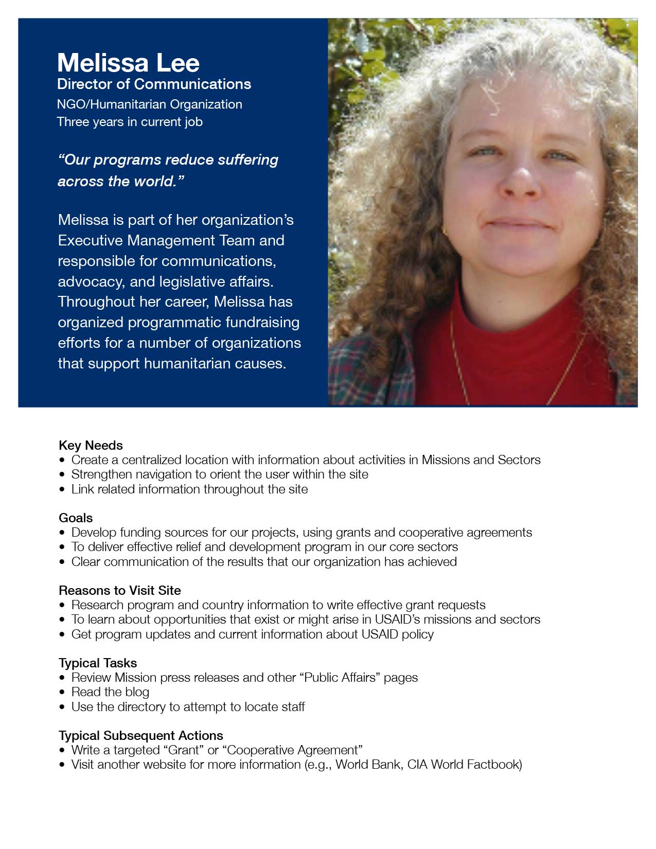


Using data collected during the focus group activities, I identified several key audience types. To present a composite view of the people in each group, I created User Personas to describe key requirements and motivators for the segment. Personas are useful in UX development, because each composite personality provides a reference point for designers to quickly consider if decisions being made support user needs. During a presentation to stakeholders, the UX team and I framed the discussion about website features using the personalities developed in the personas.
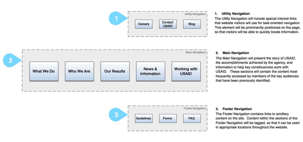
Site Architecture and Structural Design
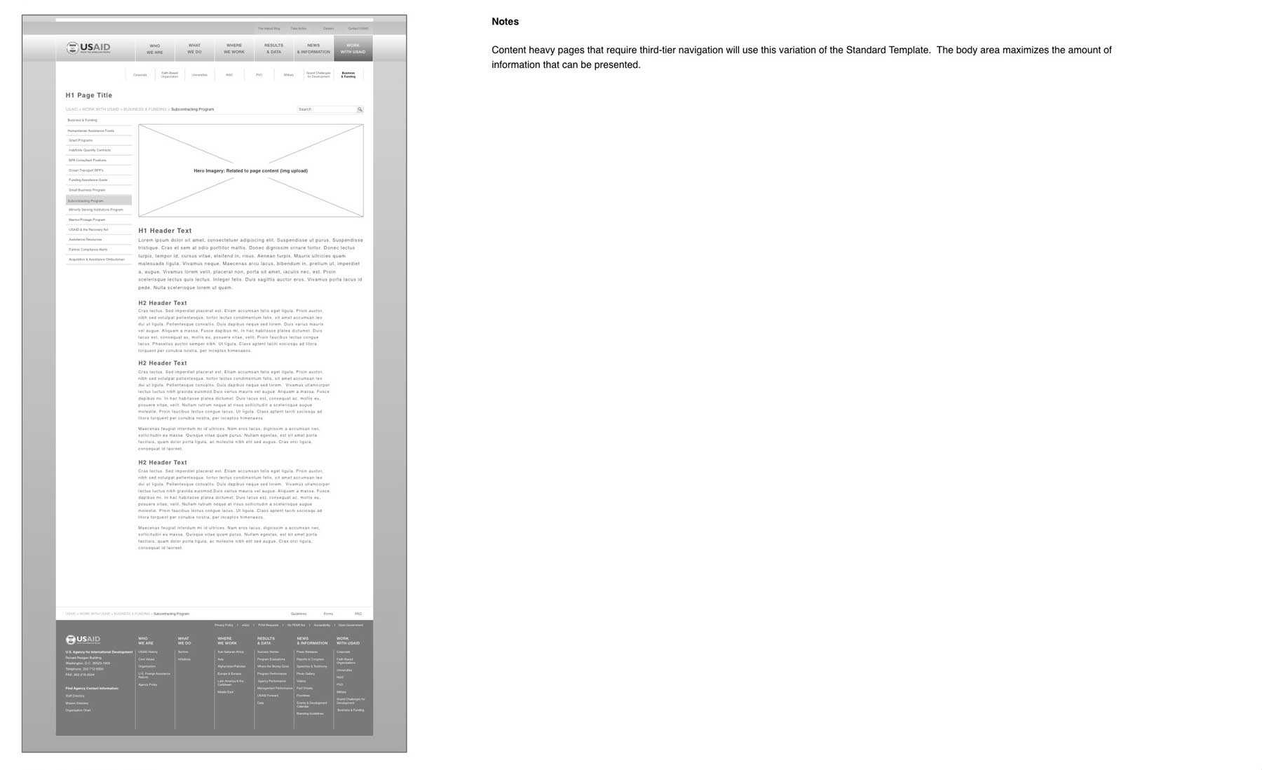
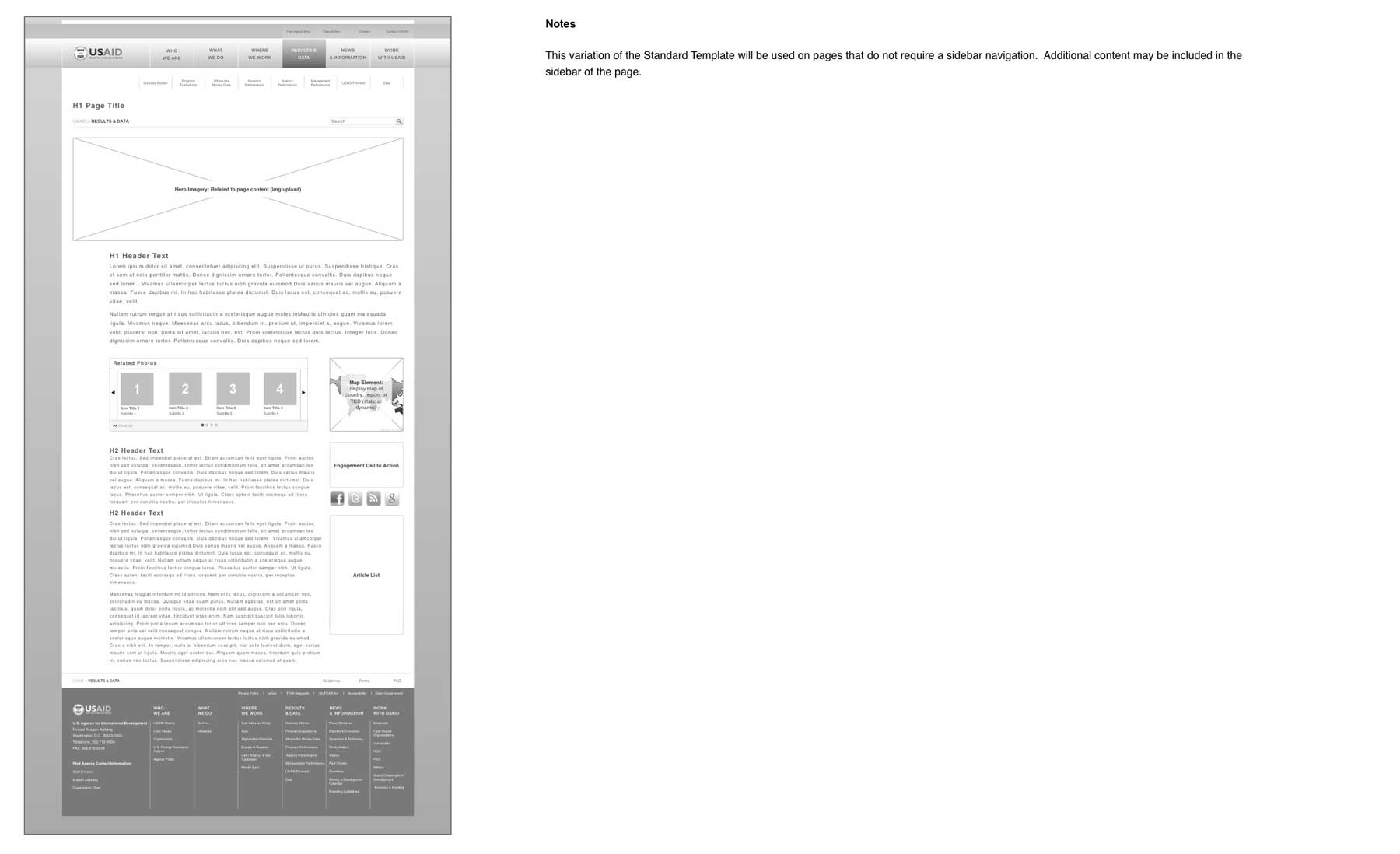
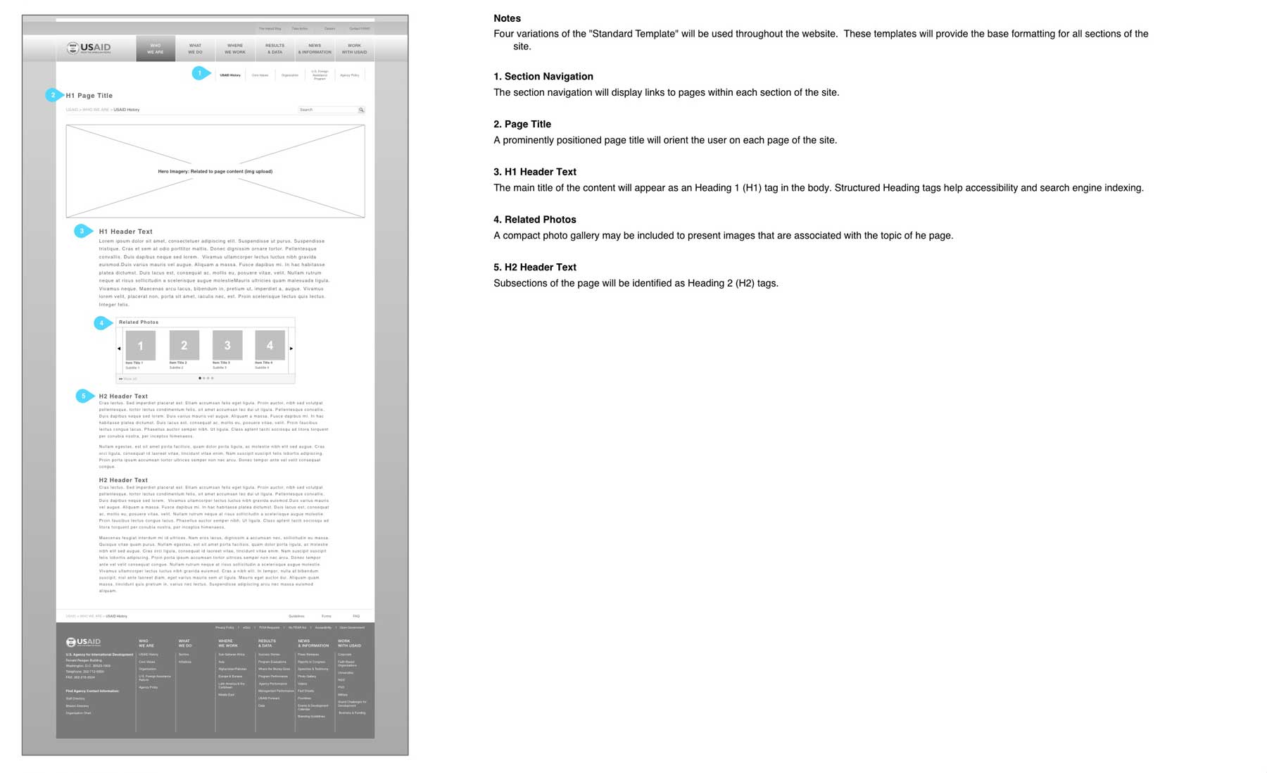
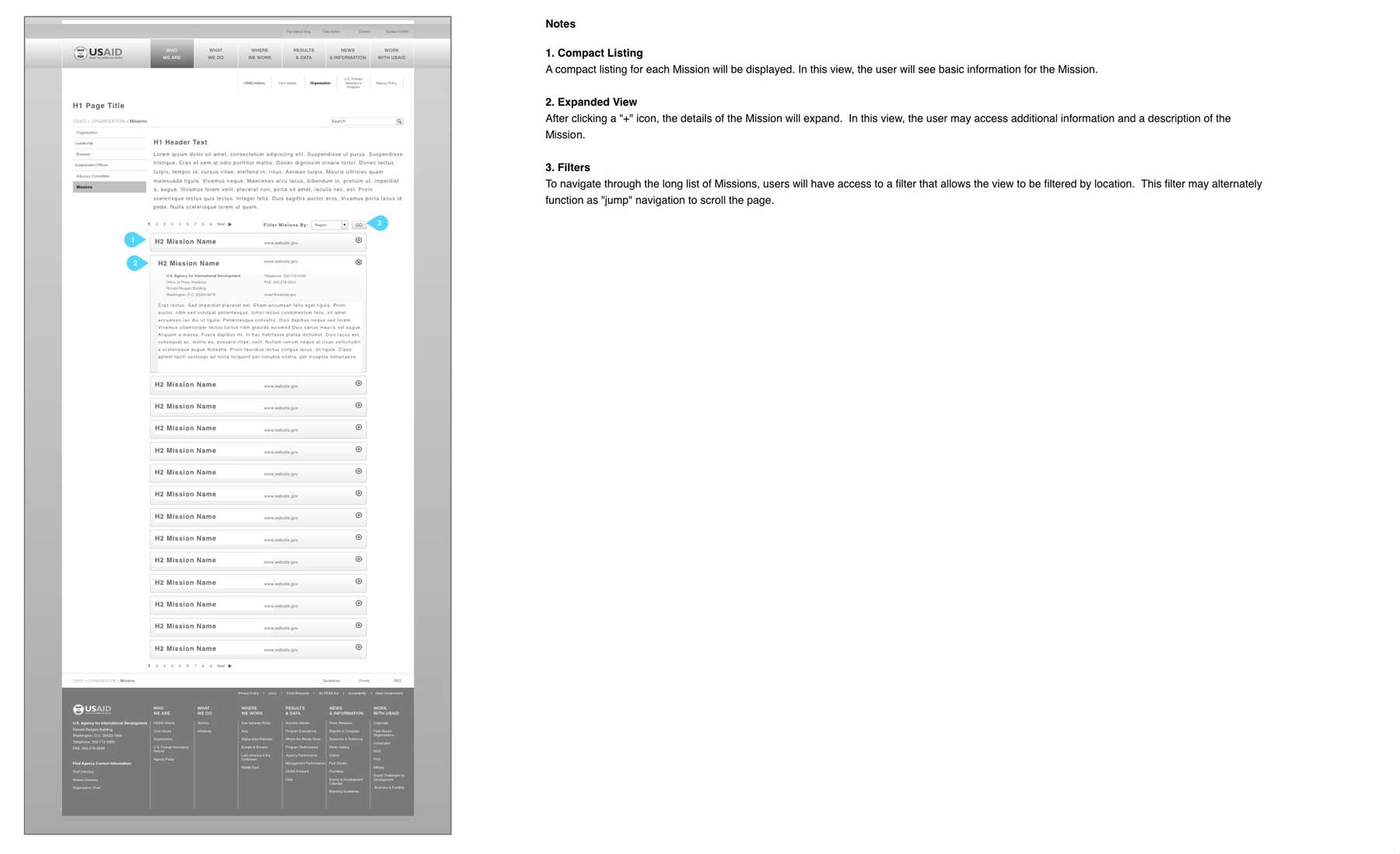
Up to this point in the project, that focus of all activities had been to develop an understanding of the existing website and the needs of both users and stakeholders. As the Structural design phase began, the emphasis of the project shifted to what could be built during the redevelopment. Findings from the Card Sort activities, combined with other primary research, helped me to develop a navigational system for the site. In collaboration with the UX team, I refined the navigational approach over several rounds of critique and improvement. The resulting structure was build around three navigational areas within the page design: Utility Navigation, Main Navigation, and Footer Navigation. Each area served a distinct navigational purpose.
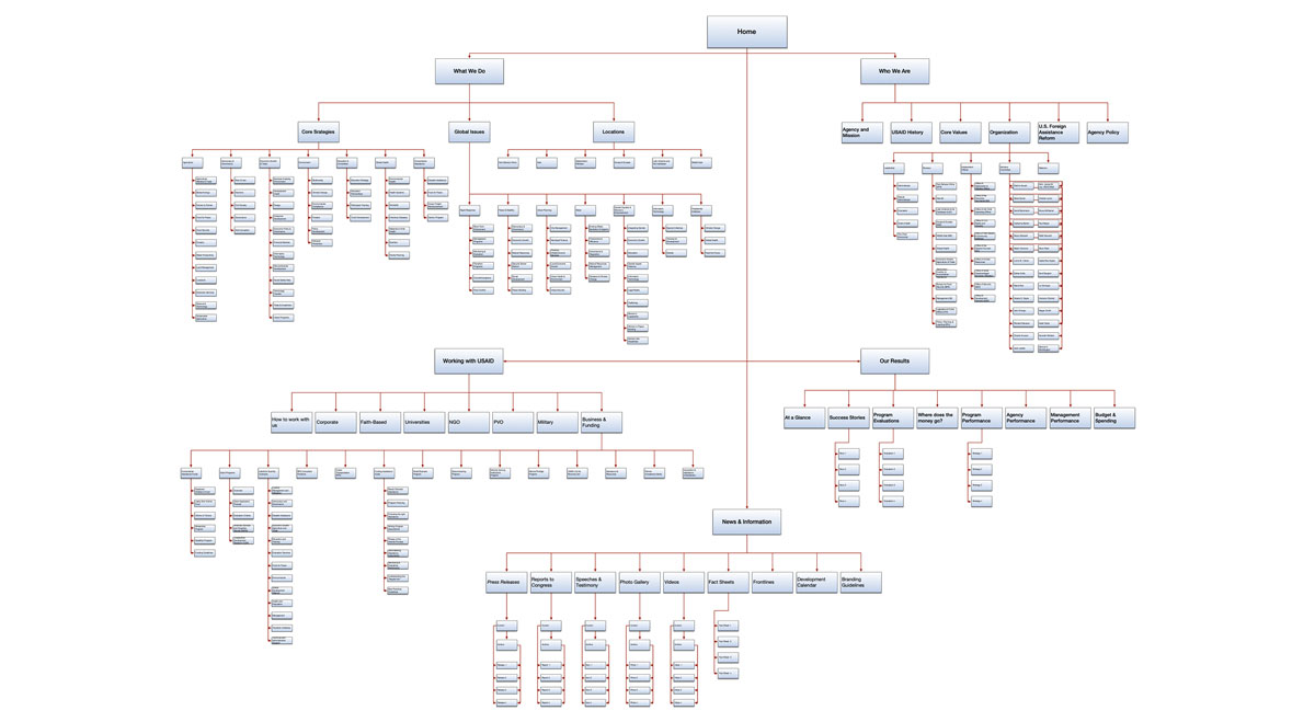
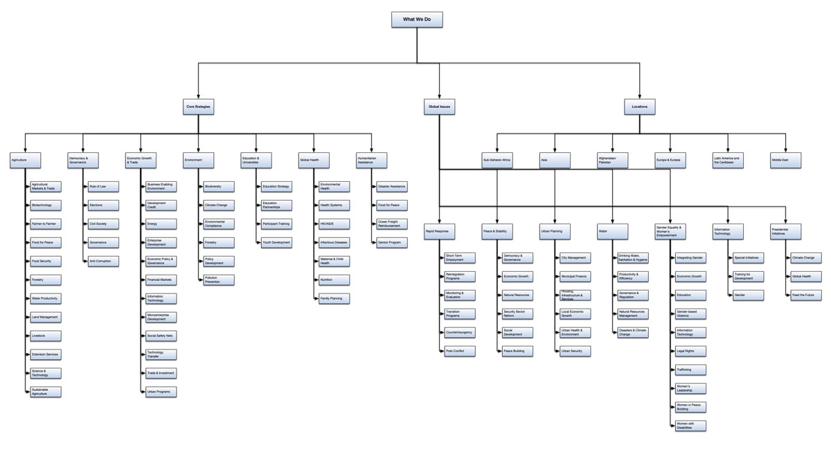
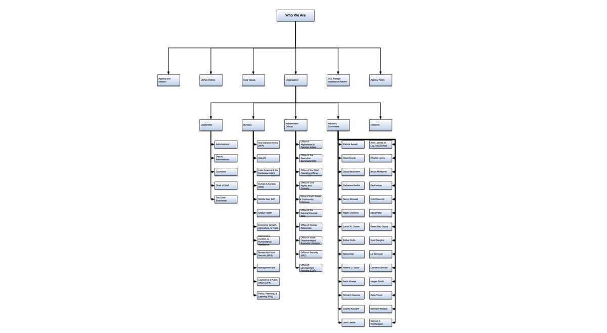
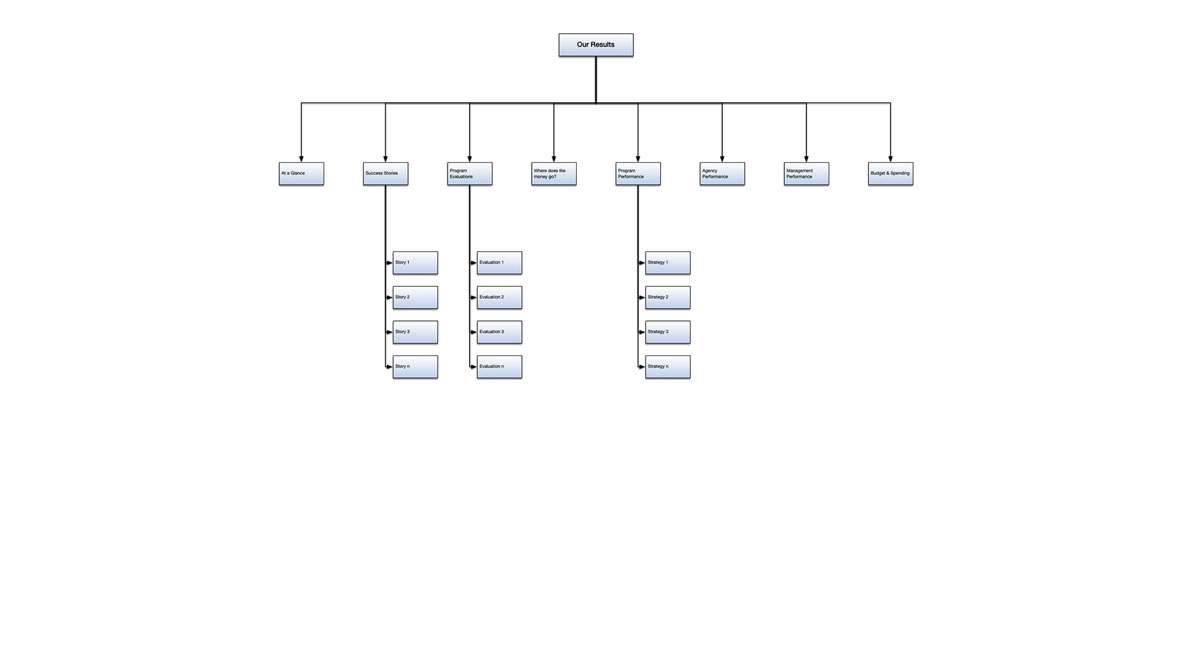
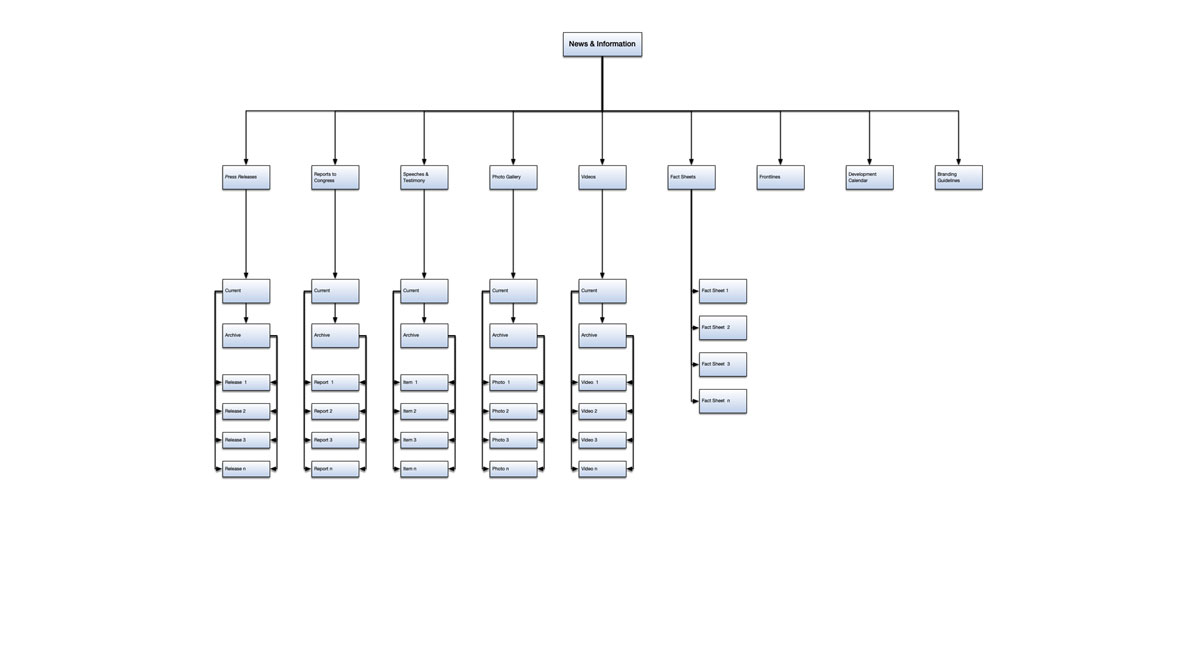
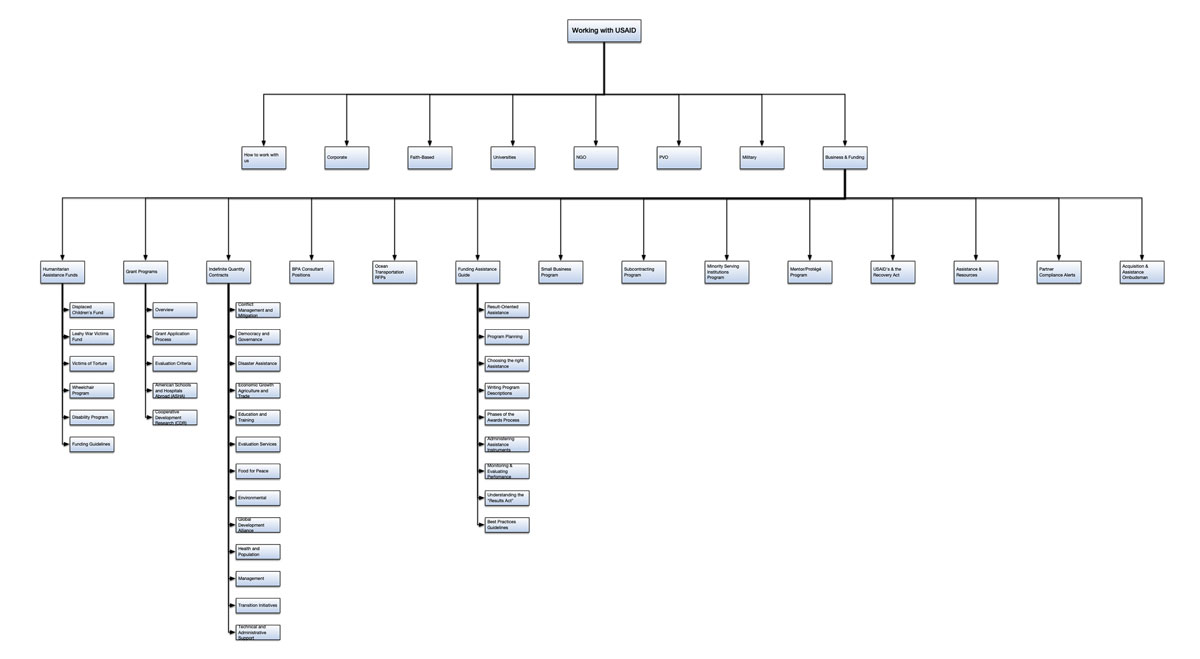
Developing a Sitemap
Over the course of the project, I streamline the site content and organization of materials to reduce the overall page count by nearly 1,000 pages. The resulting sitemap grouped relevant information into clearly labeled categories to enhance the user’s ability to locate content.
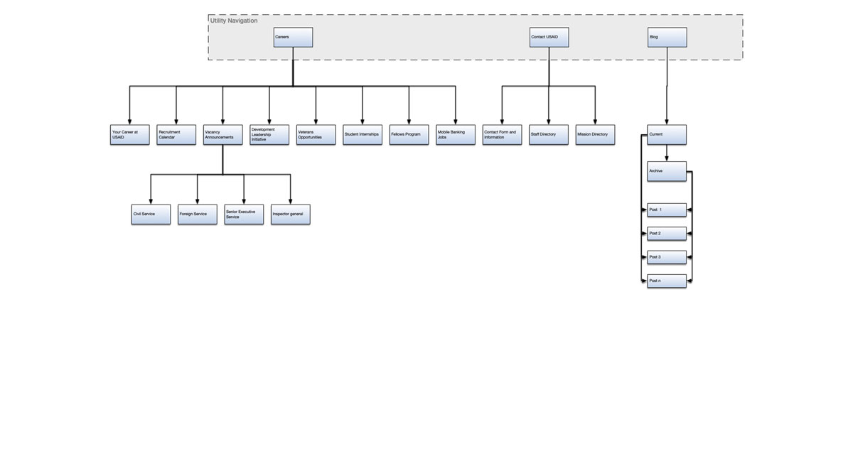
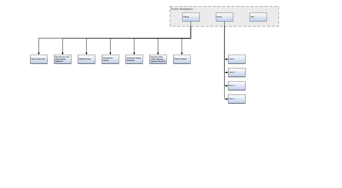
Sitemap Details
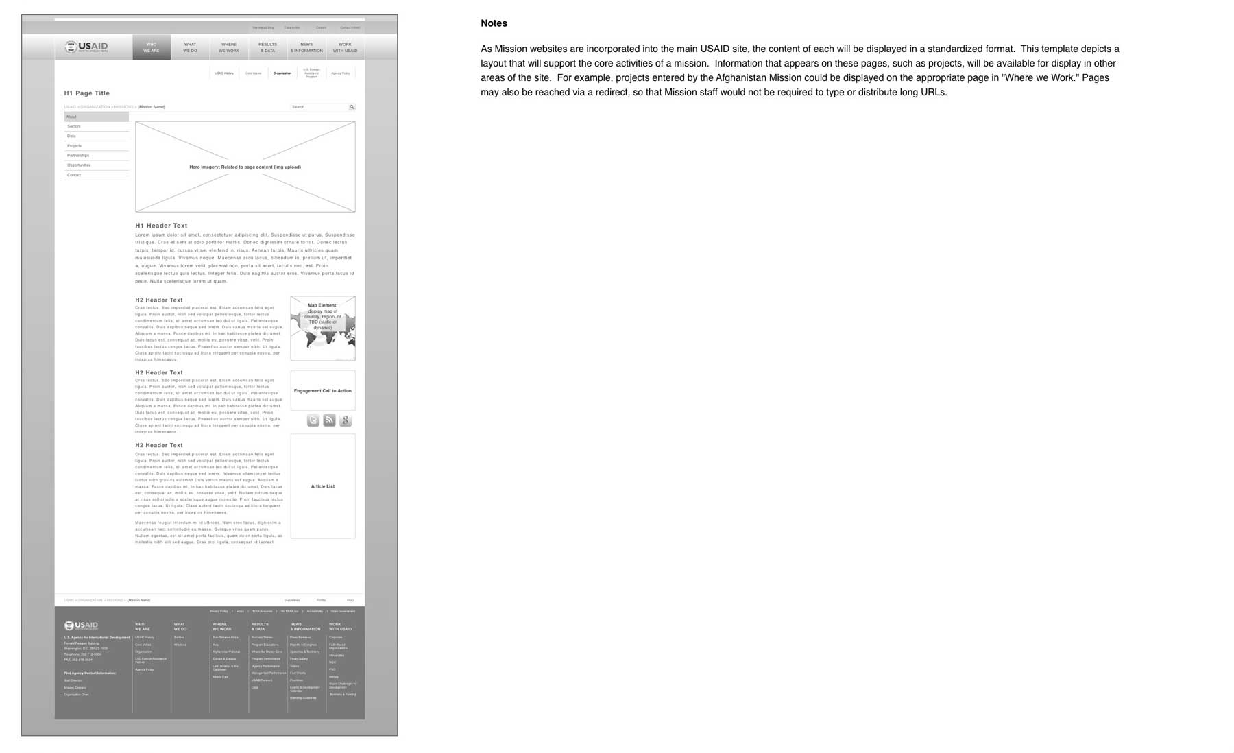
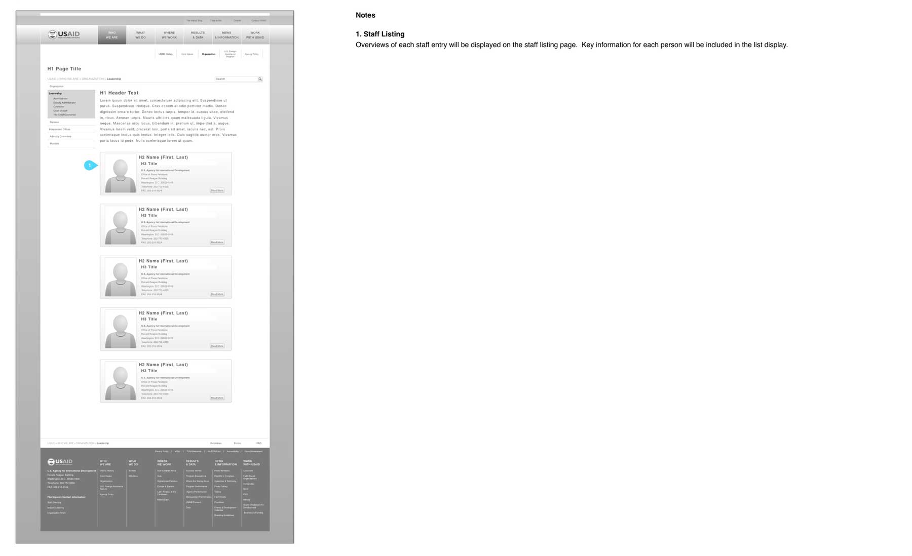
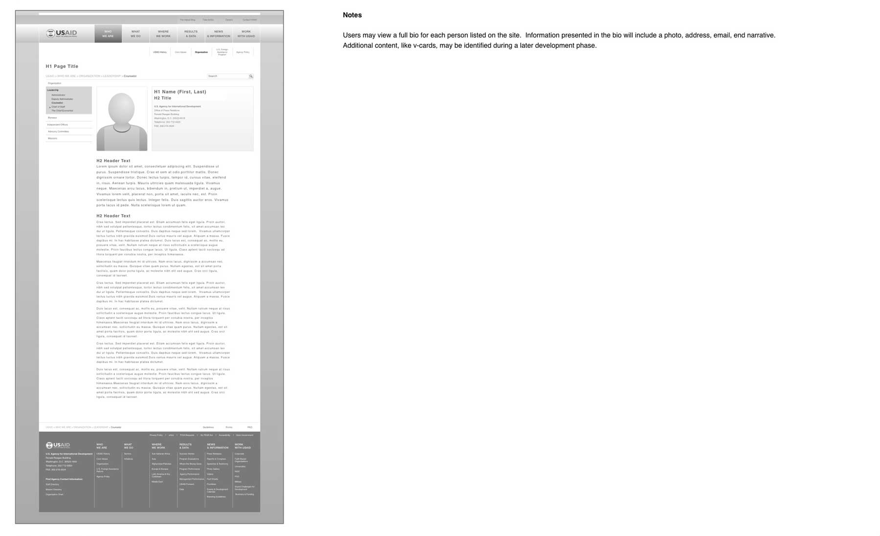
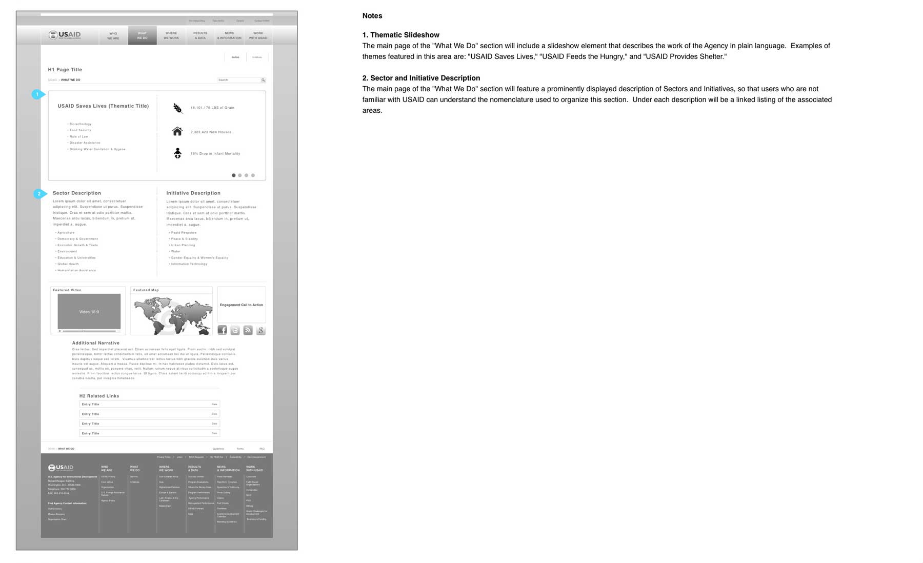
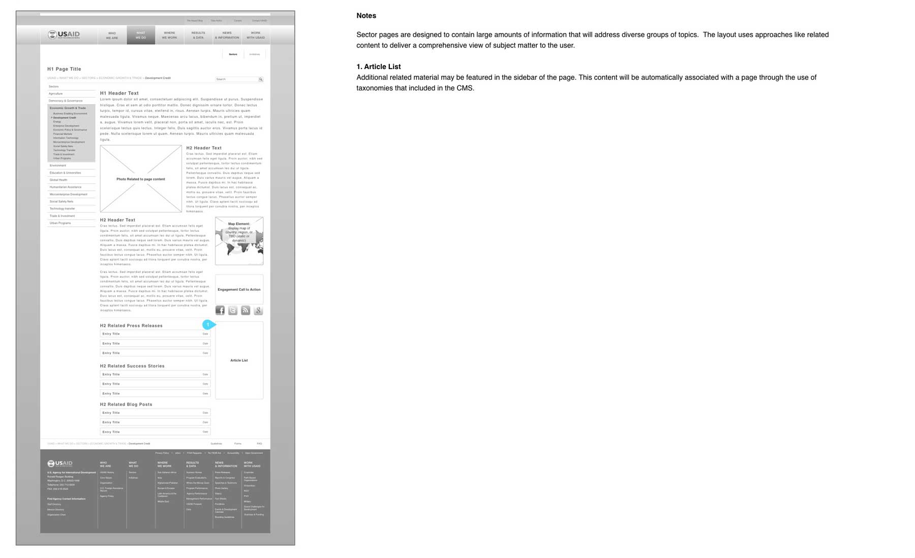
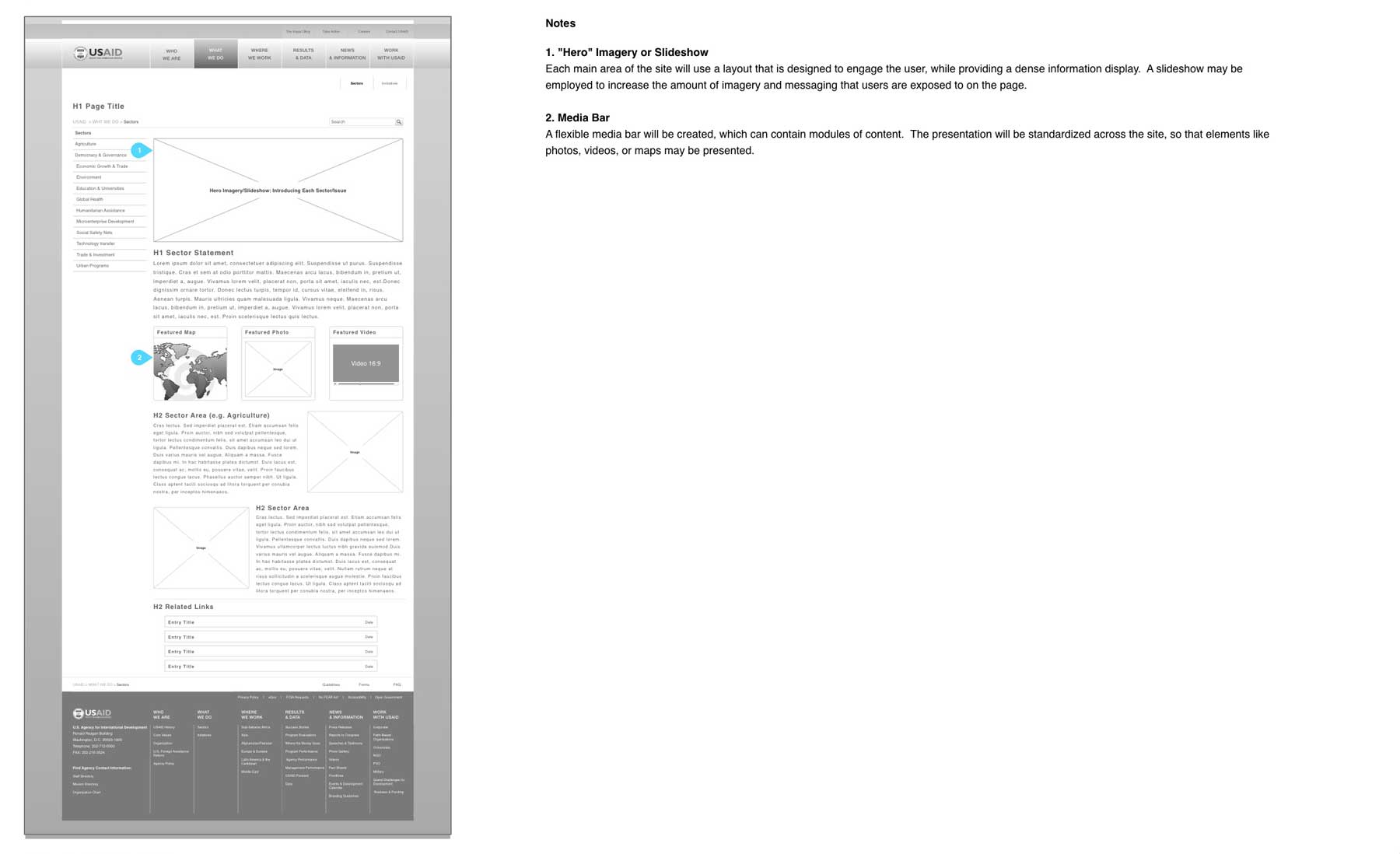
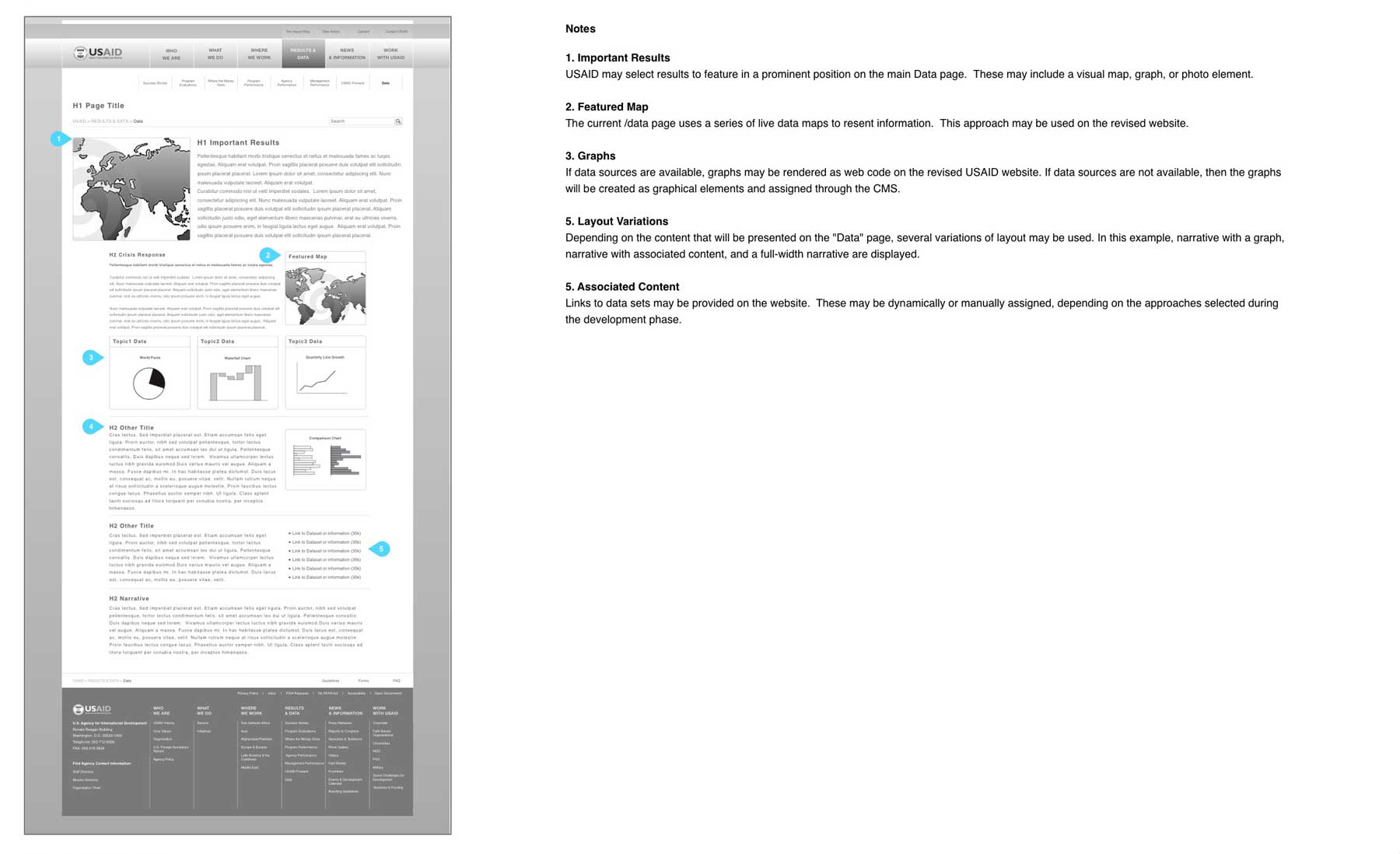
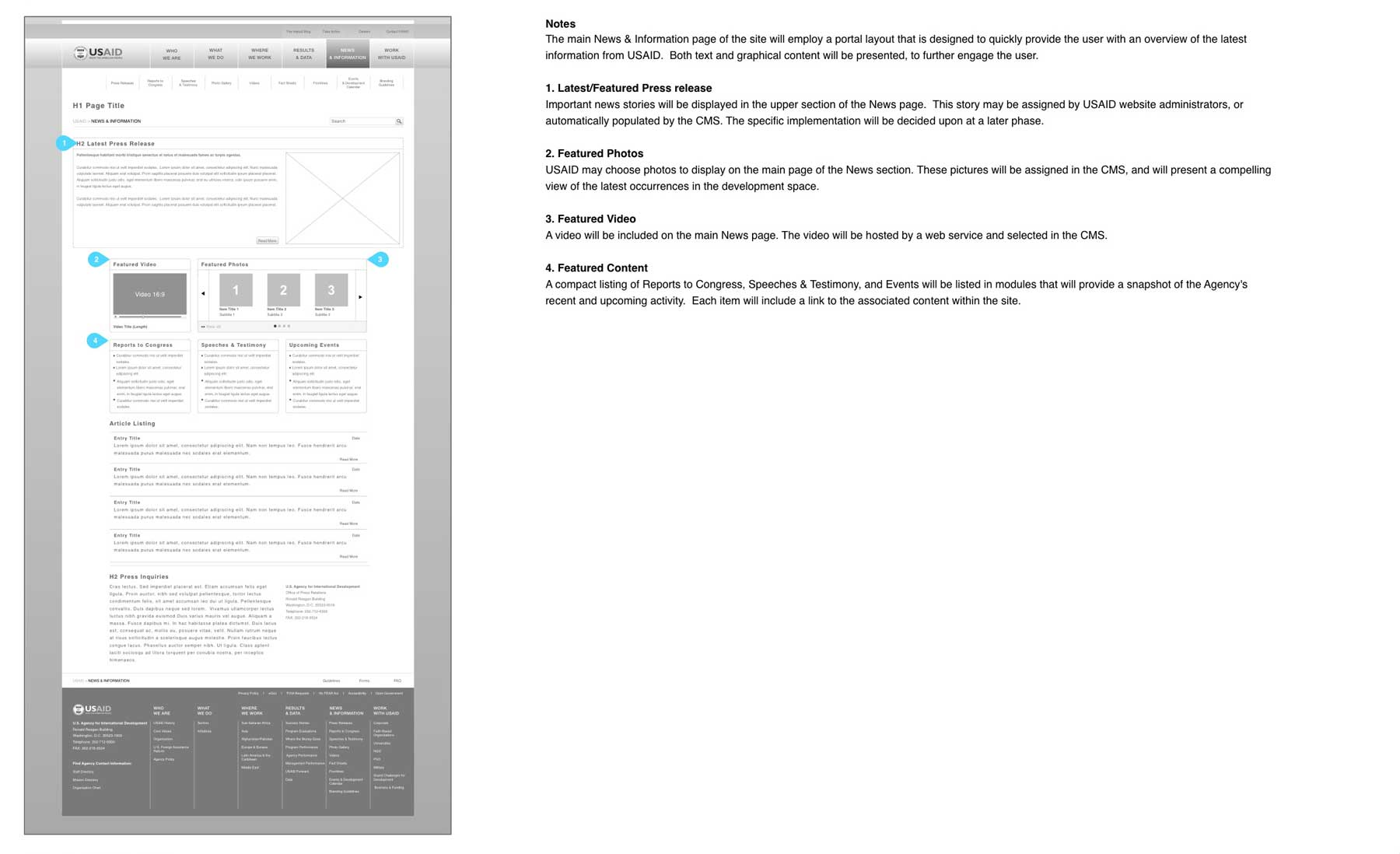
Wireframe Diagrams
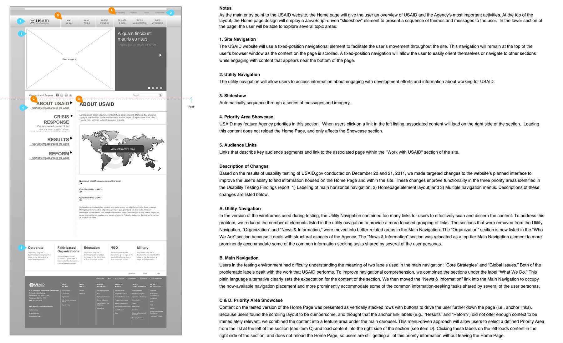
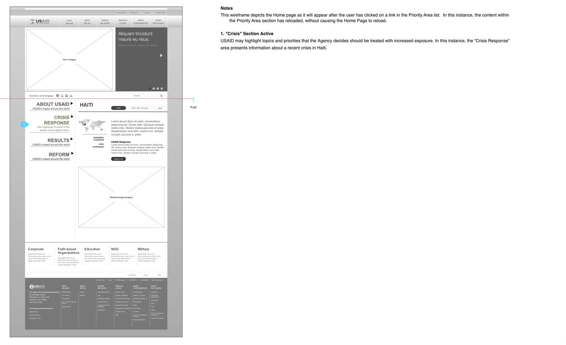
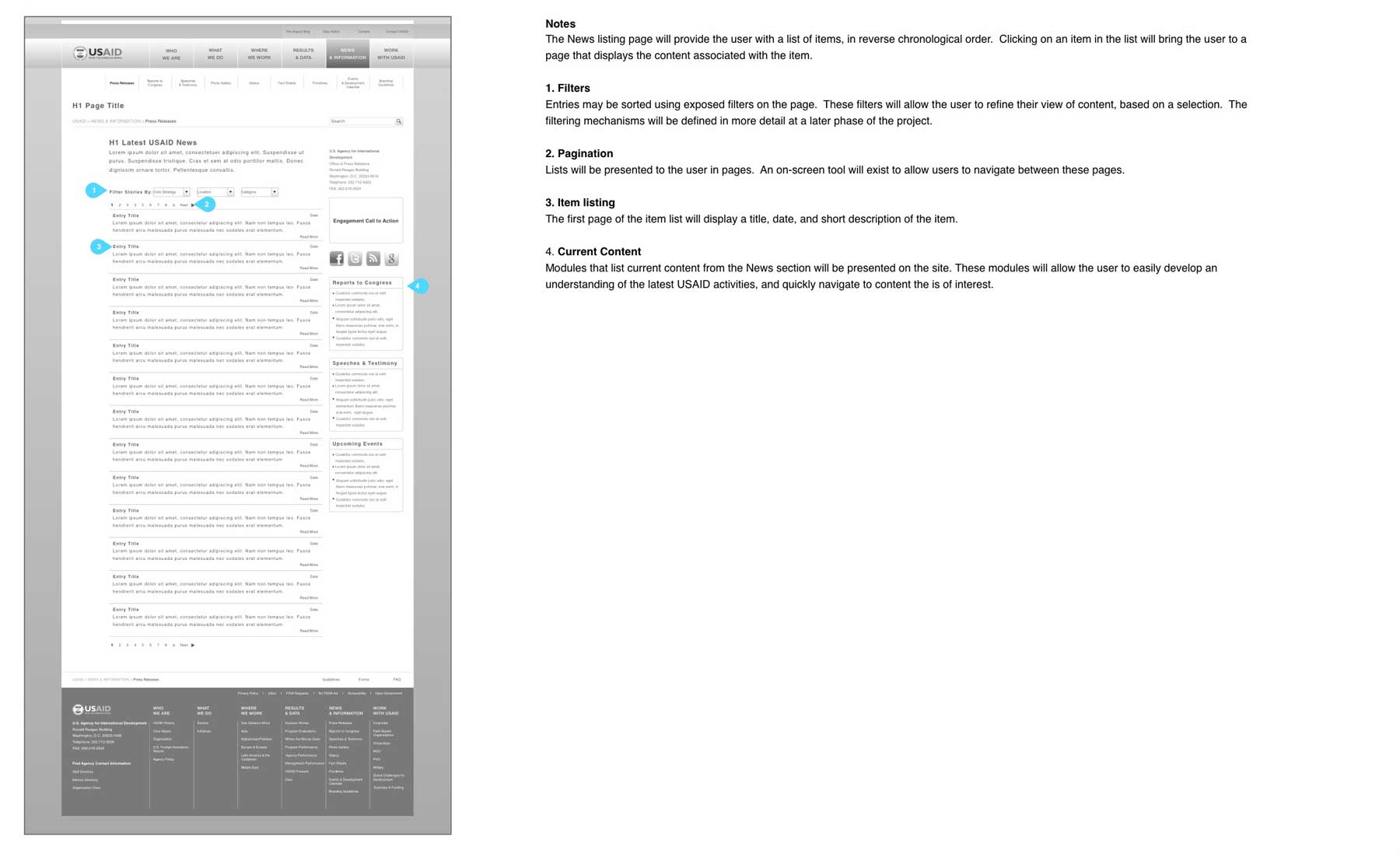
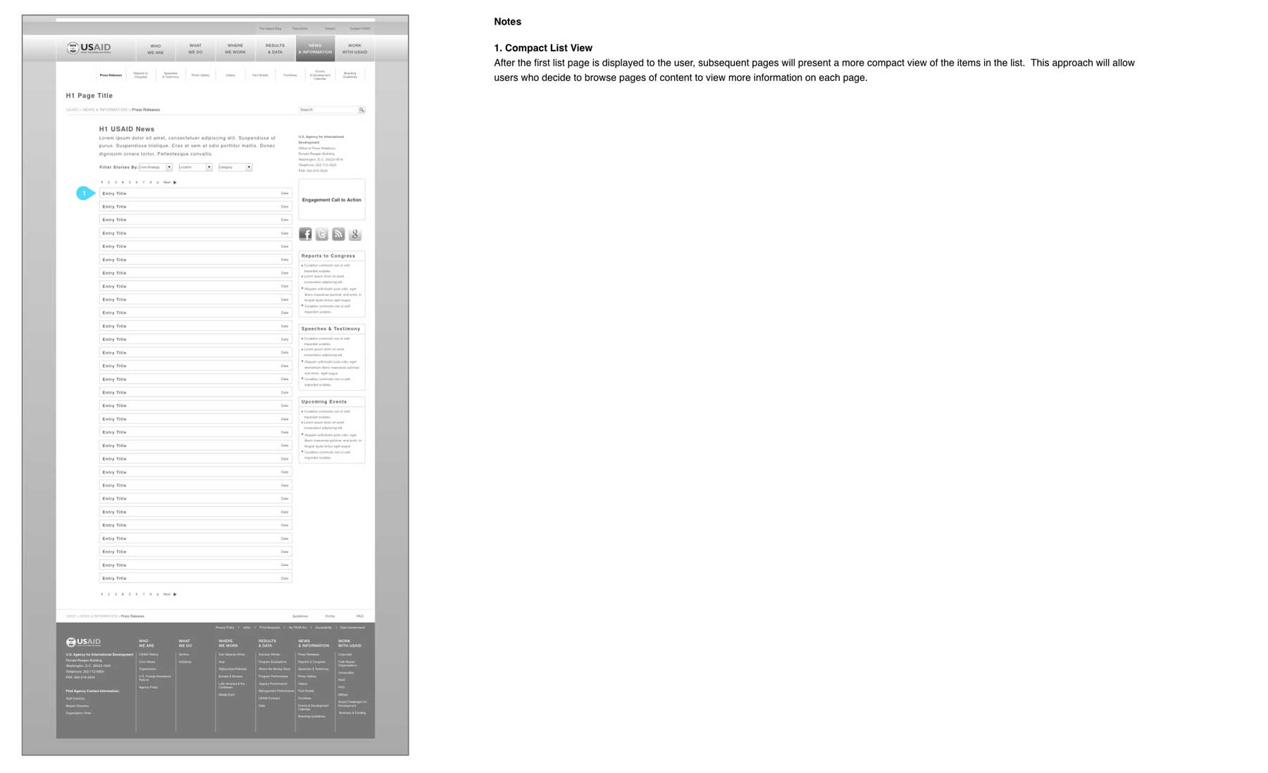
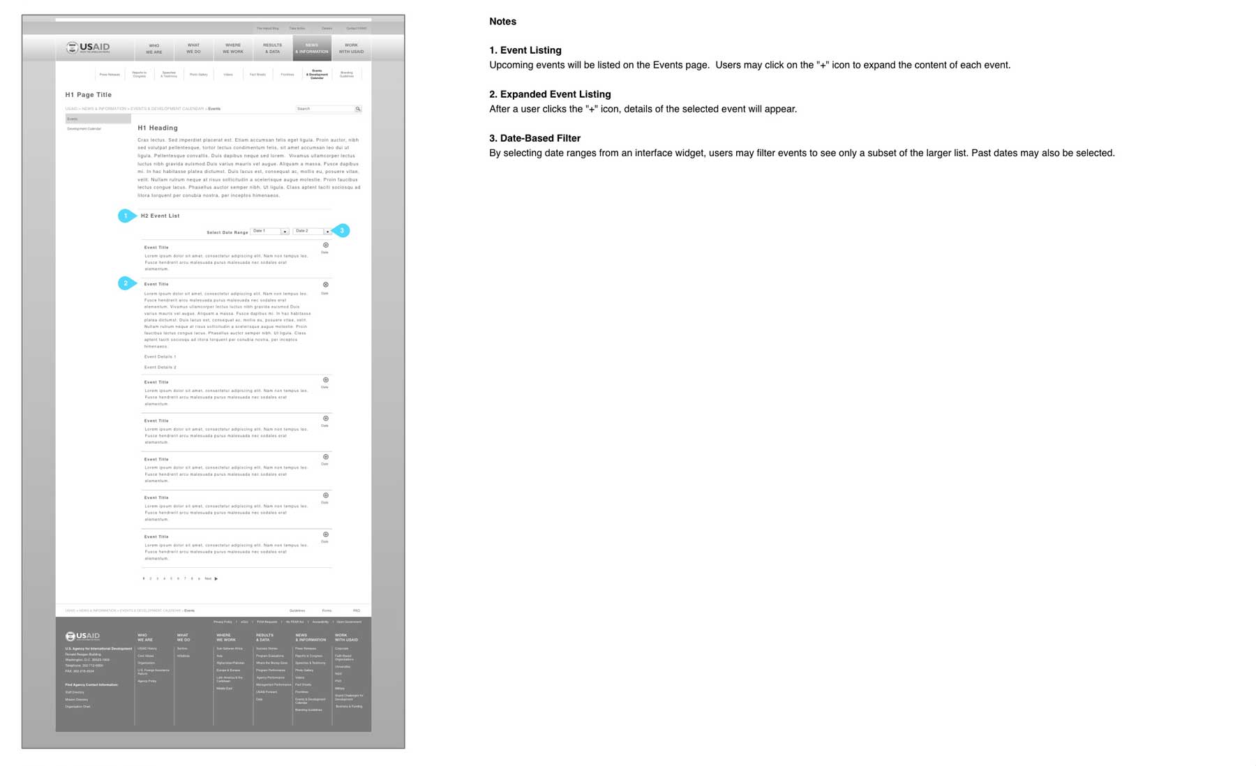
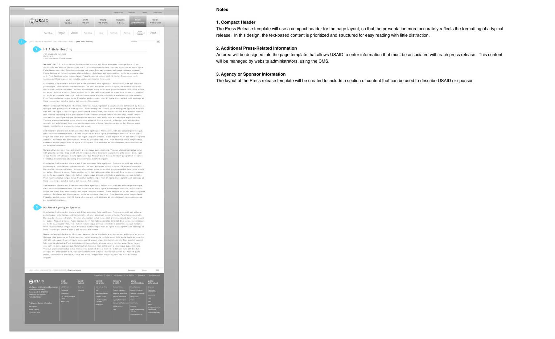
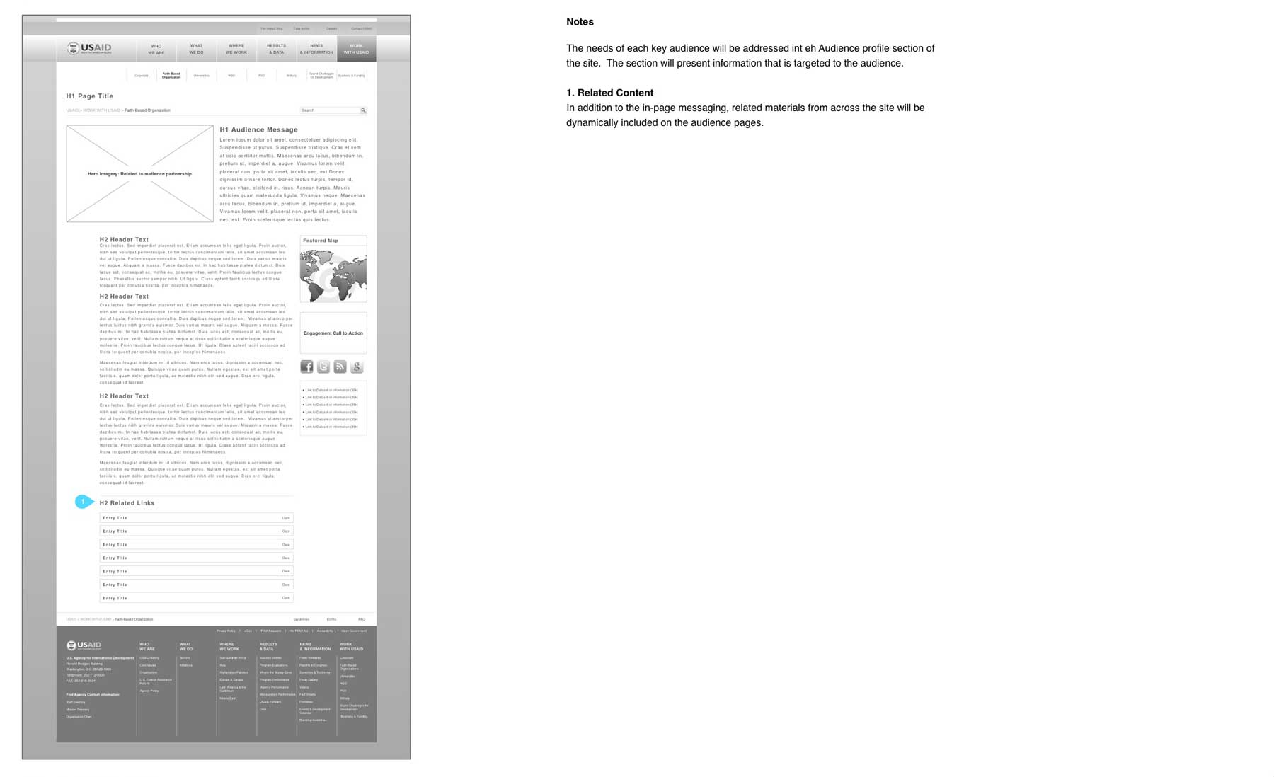
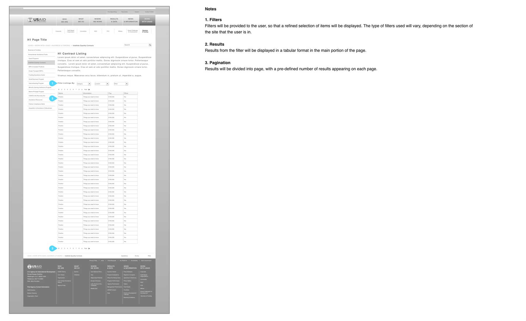
I developed interactive wireframe diagrams that supported the navigational needs of the new website and delivered the content that users prioritized during the research phase. Given the specific types of material that needed to be included on the various pages, I developed over twenty primary and derivative wire from diagrams. Each wireframe included functional elements, such as navigation and supporting controls. These active areas allowed the wireframes to be used as a prototype to demonstrate exactly how the site would operate. The interactive prototypes also allowed the team to conduct performance testing with the interface to validate the effectiveness of each design. Based on stakeholder comments and testing outcomes, I made a series of adjustments to optimize page flow and usability.
Usability Testing
I validated the usability of the final designs using a performance testing model. During the test, each user was asked to complete a series of tasks using a “think aloud” approach to talk through their thought process as each task was completed. Based on observation, each user task was scored to determine it the subject completed, had difficulty, or could not accomplish the desired outcome. Analysis of these data were helpful in quantifying the effectiveness of the design and informing where subsequent refinements were needed.

Results
The User Experience design of the USAID website achieved all of the business objectives for the project and resulted in creating a strong foundation for the visual and technological development of the platform. Across the board, usability and user satisfaction were demonstrably improved. The UX phase of the project also served to establish stakeholder and executive support for the design approach, which helped to ensure a successful project delivery.
Optimized Site Structure
The original USAID website had grown organically for many years, with pages being created on an ad hoc basis and new navigational levels being created. By analyzing user feedback, content requirements, and conducting open and closed card sorts, I was able to able streamline the site structure and remove three navigational levels without loosing content. This resulted in a 42% reduction in navigation levels.
Focused Content and Fewer Pages
It became evident during he research phase that users could not effectively locate content and needed to visit multiple pages to complete basic tasks. As an outcome of the content and structural design phases, I was able to achieve a 66% reduction in overall page count. In addition to improving the user’s ability to find content, this reduction also reduced the amount of administrative overhead that was required to maintain the website.
Onsite Content to Streamline Navigation
Many areas o the original website used linked to offsite pages in the navigational structure. This was a confusing approach, because users did not always know that they had been taken to a new website. Through content and structural optimizations, the problem of offsite pages was completely eliminated form the redesigned website.